
Note: The maps on the left show the area of the Greenland ice sheet with at least one day of surface melting in summer. The diagram on the left shows the cumulated melt area, which is defined as the annual total sum of every daily ice sheet melt area. For example, if a particular area is melting on 20 days in a given year, it is counted 20 times.

Cumulative specific net mass balance of selected glaciers from European glaciated regions
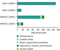
Comparison of the average annual costs of adaptation in developed countries

Comparison of the average annual costs of adaptation in developing countries
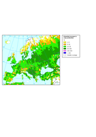
Potential increase in crop production under an adaptation scenario
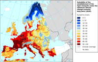
Projected suitability of the establishment of the tiger mosquito
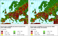
Present and projected annual water availability per person

Present and projected water limitation of crop primary production in Europe under rain-fed conditions
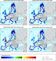
People expected to be at risk of flooding without adaptation in the medium-long term
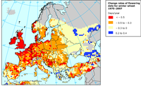
Changes of the flowering date for winter planted wheat between 1975 and 2007
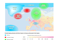
Colours show population density
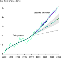
The solid lines are based on observations smoothed to remove the effects of interannual variability (light lines connect data points). Data in most recent years are obtained via satellite based sensors. The envelope of IPCC (2001) projections is shown for comparison; this includes the broken lines as individual projections and the shading as the uncertainty around the projections.
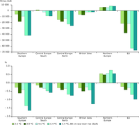
Annual damage and welfare change due to climate change
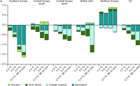
Sectoral decomposition of regional welfare changes due to climate change

Vulnerability of assessed butterfly and amphibian species of different vulnerability categories in bio-geographical regions
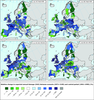
Expected impact of climate change on future flood damage
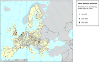
This map presents riverine flood damage potential for a 100-year return period, current climate and no defences; catchments and sub-catchments of less than 500 km2 are not included
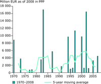
Losses from major flood disasters in Europe between 1970 and 2008
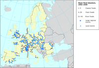
Major flood disasters according to flood types and spatial relevance
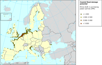
Damage potential of coastal flooding in Europe