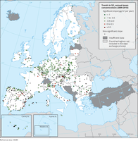
The map shows trend analysis considering SO2 annual mean observations at monitoring sites. The coloured squares represent stations with "significant" trends, while the black dots represent stations with “non-significant” trends.

The map shows trend analysis considering 99.8 percentile (p99.8) of the NO2 hourly concentrations at monitoring sites. The coloured squares represent stations with "significant" trends, while the black dots represent stations with “non-significant” trends.
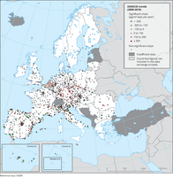
The map shows trend analysis considering the ozone indicator SOMO35 calculated at monitoring sites. The coloured squares represent stations with "significant" trends, while the black dots represent stations with “non-significant” trends.
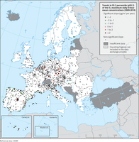
The map shows trend analysis considering the 93.2 percentile of O3 maximum daily 8-hour concentrations at monitoring sites. The coloured squares represent stations with "significant" trends, while the black dots represent stations with “non-significant” trends
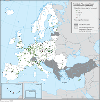
The map shows trend analysis considering PM2.5 annual mean observations at monitoring sites. The coloured squares represent stations with "significant" trends, while the black dots represent stations with “non-significant” trends.

Observed concentrations of NO2 in 2019. The data presented were reported as up-to-date (UTD) data and therefore should be considered as not validated. They are used for the purpose of providing a preliminary assessment of the situation in 2019 in relation to the NO2 annual limit value. Triangles in the last two colour categories correspond to values above the EU annual limit value and the identical WHO AQG (40 μg/m3). Only stations with more than 75 % of valid UTD data have been included in the map.
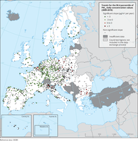
The map shows trend analysis considering the 90.4 percentile of PM10 daily observations at monitoring sites. The coloured squares represent stations with "significant" trends, while the black dots represent stations with “non-significant” trends

Observed concentrations of SO2 in 2018. The map shows the SO2 annual mean, which is not related to any legal standard, for comparison purposes. Only stations with more than 75 % of valid data have been included in the map.
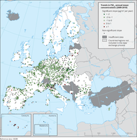
The map shows trend analysis considering PM10 annual mean observations at monitoring sites. The coloured squares represent stations with "significant" trends, while the black dots represent stations with “non-significant” trends.
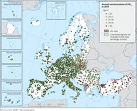
Observed concentrations of PM10 in 2018. The possibility of subtracting contributions to the measured concentrations from natural sources and winter road sanding/salting has not been considered. Dots in the last two colour categories indicate stations reporting concentrations above the EU annual limit value (40 μg/m3). Dots in the first colour category indicate stations reporting values below the WHO AQG for PM10 (20 μg/m3). Only stations with more than 75 % of valid data have been included in the map.

The Mercury regulation (Regulation (EU) 2017/852) requires countries to report on several aspects which have been grouped in four specific obligations namely: 1) reporting on activities involving the use of mercury, 2) import restriction of mercury and mercury mixtures as waste and 3) non-waste and 4) a copy of the report that is due under article 21 of the Minamata Convention. The information reported under these obligations are presented in the dataviewer below.
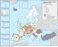
Observed concentrations of O3 in 2019. The data presented were reported as up-to-date (UTD) data and therefore should be considered as not validated. They are used for the purpose of providing a preliminary assessment of the situation in 2019 in relation to the O3 target value. The map shows the 93.2 percentile of the O3 maximum daily 8-hour mean, representing the 26th highest value in a complete series. It is related to the O3 target value. At sites marked with triangles in the last two colour categories, the 26th highest daily O3 concentrations were above the 120 μg/m3 threshold, implying an exceedance of the target value threshold. Please note that the legal definition of the target value considers not only 1 year but the average over 3 years. Only stations with more than 75 % of valid UTD data have been included in the map.
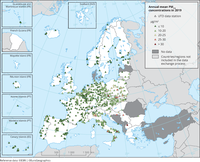
Observed concentrations of PM2.5 in 2019. The data presented were reported as up-to-date (UTD) data and therefore should be considered as not validated. They are used for the purpose of providing a preliminary assessment of the situation in 2019 in relation to the PM2.5 annual limit value. Furthermore, the possibility of subtracting contributions to the measured concentrations from natural sources and winter road sanding/salting has not been considered. Triangles in the last two colour categories indicate stations reporting concentrations above the EU annual limit value (25 μg/m3). Triangles in the first colour category indicate stations reporting values below the WHO AQG for PM2.5 (10 μg/m3). Only stations with more than 75 % of valid UTD data have been included in the map.

Observed concentrations of PM10 in 2019. The data presented were reported as up-to-date (UTD) data and therefore should be considered as not validated. They are used for the purpose of providing a preliminary assessment of the situation in 2019 in relation to the PM10 daily limit value. Furthermore, the possibility of subtracting contributions to the measured concentrations from natural sources and winter road sanding/salting has not been considered. The map shows the 90.4 percentile of the PM10 daily mean concentrations, representing the 36th highest value in a complete series. It is related to the PM10 daily limit value, allowing 35 exceedances of the 50 μg/m3 threshold over 1 year. Triangles in the last two colour categories indicate stations with concentrations above this daily limit value. Only stations with more than 75 % of valid UTD data have been included in the map.
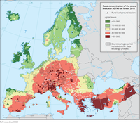
Accumulated ozone exposure values for forest — over a threshold of 40 parts per billion (AOT40f) — for 2018, as calculated for the fusion maps and as measured at rural background stations.
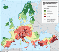
Accumulated ozone exposure values for vegetation and crops — over a threshold of 40 parts per billion (AOT40c) — for 2018, as calculated for the fusion maps and as measured at rural background stations.
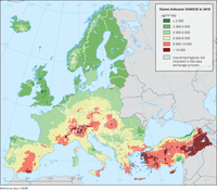
The map represents the calculated concentrations of O3 (SOMO35) combining monitoring data at regional and urban background stations with results from the European Monitoring and Evaluation Programme (EMEP) chemical transport model and other supplementary data.
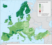
The map represents the calculated concentrations of PM10 (annual mean) combining monitoring data with results from the European Monitoring and Evaluation Programme (EMEP) chemical transport model and other supplementary data.

Global mean near-surface temperature during the last decade (2010-2019) was 0.94 to 1.03°C warmer than the pre-industrial level, which makes it the warmest decade on record. European land temperatures have increased even faster over the same period, by 1.7 to 1.9°C. All UNFCC member countries have committed in the Paris Agreement to limiting the global temperature increase to well below 2°C above the pre-industrial level and to aim to limit the increase to 1.5°C. Without drastic cuts in global greenhouse gas emissions, even the 2°C limit will already be exceeded before 2050.