
Global mean near-surface temperature during the last decade (2010-2019) was 0.94 to 1.03°C warmer than the pre-industrial level, which makes it the warmest decade on record. European land temperatures have increased even faster over the same period, by 1.7 to 1.9°C. All UNFCC member countries have committed in the Paris Agreement to limiting the global temperature increase to well below 2°C above the pre-industrial level and to aim to limit the increase to 1.5°C. Without drastic cuts in global greenhouse gas emissions, even the 2°C limit will already be exceeded before 2050.

Observed concentrations of Ni in 2018. Dots in the last two colour categories correspond to concentrations above the target value. Only stations reporting more than 14 % of valid data have been included in the map.
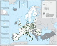
Observed concentrations of Pb in 2018. Dots in the last two colour categories correspond to concentrations above the EU annual limit value. Only stations reporting more than 14 % of valid data have been included in the map.
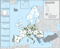
Observed concentrations of Cd in 2018. Dots in the last two colour categories correspond to concentrations above the target value. Only stations reporting more than 14 % of valid data have been included in the map.

Observed concentrations of As in 2018. Dots in the last two colour categories correspond to concentrations above the EU target value. Only stations reporting more than 14 % of valid data have been included in the map.

Observed concentrations of CO in 2018. The map shows the CO maximum daily 8-hour mean. Dots in the last two colour categories correspond to values above the EU annual limit value and the WHO AQG (10 mg/m3). Only stations with more than 75 % of valid data have been included in the map.

Observed concentrations of BaP in 2018. Dots in the first colour category correspond to concentrations under the estimated RL (0.12 ng/m3). Dots in the last colour category correspond to concentrations exceeding the 2004 Ambient Air Quality Directive target value of 1 ng/m3.
Only stations reporting more than 14 % of valid data, as daily, weekly or monthly measurements, have been included in the map.

Observed concentrations of NO2 in 2018. Dots in the last two colour categories correspond to values above the EU annual limit value and the identical WHO AQG (40 μg/m3). Only stations with more than 75 % of valid data have been included in the map.
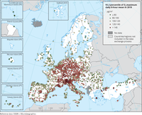
Observed concentrations of O3 in 2018. The map shows the 93.2 percentile of the O3 maximum daily 8-hour mean, representing the 26th highest value in a complete series. It is related to the O3 target value. At sites marked with dots in the last two colour categories, the 26th highest daily O3 concentrations were above the 120 μg/m3 threshold, implying an exceedance of the target value threshold. Please note that the legal definition of the target value considers not only 1 year but the average over 3 years. Only stations with more than 75 % of valid data have been included in the map.
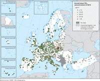
Observed concentrations of PM2.5 in 2018. The possibility of subtracting contributions to the measured concentrations from natural sources and winter road sanding/salting has not been considered. Dots in the last two colour categories indicate stations reporting concentrations above the EU annual limit value (25 μg/m3). Dots in the first colour category indicate stations reporting values below the WHO AQG for PM2.5 (10 μg/m3). Only stations with more than 75 % of valid data have been included in the map.
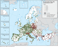
Observed concentrations of PM10 in 2018. The map shows the 90.4 percentile of the PM10 daily mean concentrations, representing the 36th highest value in a complete series. It is related to the PM10 daily limit value, allowing 35 exceedances of the 50 μg/m3 threshold over 1 year. Dots in the last two colour categories indicate stations with concentrations above this daily limit value. Only stations with more than 75 % of valid data have been included in the map. The possibility of subtracting contributions to the measured concentrations from natural sources and winter road sanding/salting has not been considered.
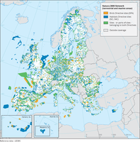
The map shows the Natura 2000 sites (version 2018) for EU28 countries.
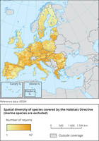
The map shows the number of terrestrial ART17 species reports per 10x10km GRID cells (2013-2018)
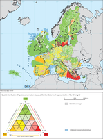
The map shows an index of conservation status of species calculated on a 10 x 10 km distribution grid
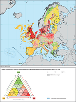
The map shows an index of habitat conservation status calculated on a 10 x 10 km distribution grid.

The map shows an index of conservation status trends of species calculated on a 10 x 10 km gristribution grid
![The maximum WBGT [°C] during a hot summer day in the Antwerp city centre The maximum WBGT [°C] during a hot summer day in the Antwerp city centre](https://www.eea.europa.eu/data-and-maps/figures/the-maximum-wbgt-during-a/image_mini)
The map shows the maximum WBGT values; those exceeding 25 °C indicate heat stress. Locations with trees and/or water surfaces are the coolest, whereas the highest heat stress values are found over paved squares and streets where there is no shading.
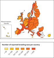
This map is a cartogram that distorts the geometry of regions to convey specific information by resizing. Here, the size of the country shows the number of reported species in relation to the country size. The map do not show all species appearing in a country. Thus, the map shows the reporting result rather than the species diversity of a country. The box on the bottom left refers to the Macaronesian islands (Azores, Madeira and Canary islands). Romania has not reported and is therefore not included in the map.

This map shows the places where respondents feel bad due to excessive heat in Prage in 2018.
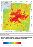
Average climate suitability map for the tiger mosquito for the city of Ljubljana (Slovenia) based on climate data for the years 2008-2009