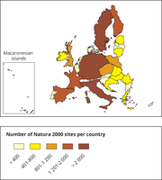
This map is a cartogram that distorts the geometry of regions to convey specific information by resizing. The box on the bottom left refers to the Macaronesian islands (Azores, Madeira and Canary Islands). It only includes terrestrial Natura 2000 sites for EU-28 (SPAs, SACs, SCIs and proposed SCIs).
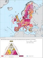
The map shows an index of conservation status trends of habitats calculated on a 10 x 10 km distribution grid

The map shows the biogeographical and marine regions for EU-28 countries.
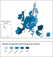
This map is a cartogram that distorts the geometry of regions to convey specific information by resizing. Here, the size of the country shows the number of reported species in relation to the country size. The map do not show all species appearing in a country. Thus, the map shows the reporting result rather than the species diversity of a country. The box on the bottom left refers to the Macaronesian islands (Azores, Madeira and Canary islands). Romania has not reported and is therefore not included in the map.

The overlap for Norway and Switzerland relates to Emerald Network sites. For all other countries the overlap relates to Natura 2000 sites. Statistics on national designations are based on data reported by EEA countries to the Nationally designated areas (CDDA) database.
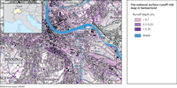
The map shows which regions of Switzerland are at risk from surface runoff and how deep they may be under water, as well as the anticipated flood paths of the water.
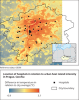
The map shows the location of hospitals in relation to urban heat island in Prague

The map shows the climate risk typology developed In the EU-funded H2020 project RESIN. The NUTS3 regions have been categorised into 8 groups according to the main climate hazards, exposure of population and infrastructure, sensitivity of the population and adaptive capacity of the areas.

The selection of cities comes from the source data. The P90 (90th percentile) indicator of the climatic suitability of the urban area for tiger mosquito represents the specific exposure of single cities and is independent of the model domain or size of a city. Since it is the 90th percentile, there are grid cells (areas) in a city with an even higher suitability value, so it can be considered a rather conservative value. For specific values for individual cities, see the Urban Adaptation Map Viewer.
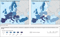
The map shows the number of local authorities per country that are signatories to the Covenant of Mayors (left map) or participate in the 'Making cities resilient' campaign by UNDRR (right map).

The maps show the spatial distribution of the European cities participating by the EU-funded research, implementation and knowledge exchange projects.
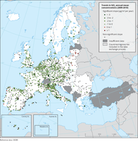
The map shows trend analysis considering NO2 annual mean observations at monitoring sites. The coloured squares represent stations with "significant" trends, while the black dots represent stations with “non-significant” trends.

The map shows trend analysis considering the ozone indicator AOT40 for vegetation calculated at monitoring sites. The coloured squares represent stations with "significant" trends, while the black dots represent stations with “non-significant” trends
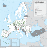
The map shows trend analysis considering SO2 annual mean observations at monitoring sites. The coloured squares represent stations with "significant" trends, while the black dots represent stations with “non-significant” trends.

The map shows trend analysis considering 99.8 percentile (p99.8) of the NO2 hourly concentrations at monitoring sites. The coloured squares represent stations with "significant" trends, while the black dots represent stations with “non-significant” trends.
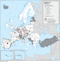
The map shows trend analysis considering the ozone indicator SOMO35 calculated at monitoring sites. The coloured squares represent stations with "significant" trends, while the black dots represent stations with “non-significant” trends.
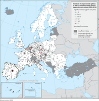
The map shows trend analysis considering the 93.2 percentile of O3 maximum daily 8-hour concentrations at monitoring sites. The coloured squares represent stations with "significant" trends, while the black dots represent stations with “non-significant” trends
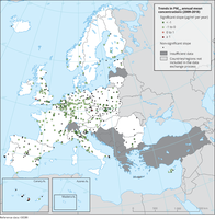
The map shows trend analysis considering PM2.5 annual mean observations at monitoring sites. The coloured squares represent stations with "significant" trends, while the black dots represent stations with “non-significant” trends.

Observed concentrations of NO2 in 2019. The data presented were reported as up-to-date (UTD) data and therefore should be considered as not validated. They are used for the purpose of providing a preliminary assessment of the situation in 2019 in relation to the NO2 annual limit value. Triangles in the last two colour categories correspond to values above the EU annual limit value and the identical WHO AQG (40 μg/m3). Only stations with more than 75 % of valid UTD data have been included in the map.
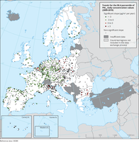
The map shows trend analysis considering the 90.4 percentile of PM10 daily observations at monitoring sites. The coloured squares represent stations with "significant" trends, while the black dots represent stations with “non-significant” trends