
Based on the logistic hail model (Mohr, Kunz, and Geyer, 2015) and reanalysis data from NCEP-NCAR (Kalnay, et al., 1996). Trends with significance below the 5% level are cross-hatched. Note that significant trends are only found for values below -5 PHI over the period.
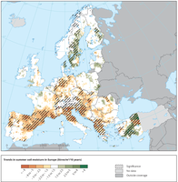
Soil moisture content was modelled using a soil moisture balance model in the upper soil horizons (up to 1 m).

The left panel shows a risk model map during summer 2006 and the number of cases in countries reporting infections. The right panel shows a projection of the risk of infection in 2050.
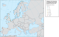
This map shows the estimated multiplication factor, by which the frequency of flooding events of a given height changes between 2010 and 2100 due to projected regional sea relative level rise under the RCP4.5 scenario. Values larger than 1 indicate an increase in flooding frequency
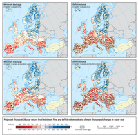
Differences between the end of the 21st century (SRES A1B scenario) and the control period (1961-1990) for minimum discharges (left) and change in occurrence of deficits (right) for climate change only (top row) and a combination of climate change and water use (bottom row).

This map shows the ensemble mean trend in summer low flow from 1963 to 2000. ‘x’ denotes grid cells where less than three- quarters of the hydrological models agree on the direction of the trend.

This map shows observed linear trends in heating degree days (left) and cooling degree days (right) over 1981–2014 for all EEA member and cooperating countries. Stippling depicts regions where the trend is statistically significant at the 5% level.
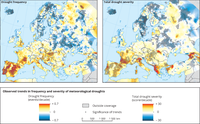
Trends in frequency (upper) and severity (lower) of meteorological droughts between 1950 and 2012. Trends are based on a combination of three different drought indices - SPI, SPEI and RDI accumulated over 12-month periods. Dots: trends significant at ≥ 95%.

The maps show changes in the frequency of meteorological droughts for two future periods (2041-2070, left and 2071-2100, right) and for two emissions scenarios (RCP4.5, top and RCP8.5, bottom). Drought frequency is defined as the number of months in a 30 year period with the Standardised Precipitation Index accumulated over a 6 month period (SPI-6) having a value below -2.
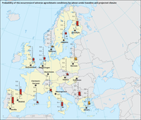
This map compares the probability that at least one out of 11 types of adverse agroclimatic conditions occurs between sowing and majority of wheat (medium-ripening cultivar) under baseline climate (1981, black bar) and projected climate (2060, coloured box). Red boxes indicate that at least 14 out of the 16 CMIP5 models show an increased probability of adverse conditions, and orange boxes indicate that at least 9 out of 16 models show an increased probability.
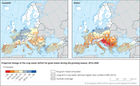
Projected annual rate of change of the crop water deficit of grain maize during the growing season in Europe for the period 2015-2045 for two climate scenarios. The crop water deficit is the difference between the crop-specific water requirement (in this case grain maize) and the water available through precipitation. The climate forcing of the two simulations is based on the two global climate models HadGEM2 and MIROC, taken from CMIP5 and bias-corrected by the ISI-MIP project (Warszawski et al., 2014). Crop model simulations have been done with the crop model WOFOST at 25 km resolution. Red colours show an increase of the gap between crop water requirement and water availability, blue colours indicate a reduction of the deficit. Areas where the seasonal crop water requirement exceeds regularly (i.e. in more than 90 % of the years) the water available through precipitation have been marked by hatches. Areas without hatches experience both deficit and surplus or only a surplus of water. In this case, red colours refer to a reduced surplus, while blue colours indicate an increasing surplus of water.

This figure shows the rate of change of the flowering date for winter wheat. The annual rate of change of the flowering date represents the trend coefficient for long-term changes in the occurrence of flowering of winter wheat in Europe. For example, a value -0.6 indicates that in last 30 years the winter wheat flowering date has been anticipated on average by 0.6 days per year (6 days in 10 years). The flowering date is derived from crop growth models simulating crop development of winter wheat as a function of the temperature sum. The simulation is based on the JRC-MARS gridded meteorological data at 25 km resolution.

Simulated change in mean water-limited crop yield of winter wheat between the baseline period around year 2000 and 2030. The four simulations are a combination of two climate models (HadGEM2 and MIROC, taken from CMIP5 archive and bias-corrected by the ISI-MIP project), and the crop model WOFOST at 25 km spatial resolution, with and without taking into account the effect of CO2 fertilization. Crop variety and agro-management practice have been kept constant. For each time horizon of 2000 and 2030, a 30-year averaging period has been considered. Red colours show a reduction in winter wheat yield, while green colours indicate an increase in crop productivity in the given period as a response to the climate signal of each climate scenario (Araujo Enciso et al., 2014).
Document Actions
Share with others