
Peak run-off reduction of different measures (%) compared to return period (years)
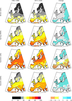
Tourism Climatic Index (TCI) for four seasons in the present period (1961–1990, left), under future climate change (2071–2100, middle), and change between present and future period (left). Future climate conditions are based on the SRES A2 scenario and derived from the ensemble mean of five regional climate models (RCMs) that participated in the PRUDENCE project.

This figure shows the yearly number of extreme weather events (cold, storm, flood and wet mass movement, heat wave, wildfire, drought and drymass movement dry)
in EEA member and collaborating countries in the period 1980 - 2011.

Changes in abundance in response to observed temperature change are relative changes (unitless).
-

Statistical frequency of the european temperature
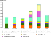
Reference = actual situation including already decided measures; scenario 1 = flood conveyance (infrastructure works in
the city); scenario 2 = flood storage concentrated in nature areas upstream; scenario 3 = flood storage distributed in the
valley; scenario 4 = further upstream flood storage in Wallonia; scenario 5 = non-structural measures (prevention, flood
forecasting, resilience measures and improved assistance). Note that in this exercise, a combined scenario of structural
and non-structural measures was not included.
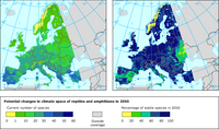
Projected data based on the Generalised Linear Model map using the HadCM3 A2 scenario for the 2050s are compared with the current situation.

The map shows the potential future alien plant invasion hotspots in Austria and Germany under climate change, based on 30 invasive alien vascular plant species and the SRES A2 and B2 emissions scenarios. Colours mark number of invasive alien species suitable in an area.

Relative change in annual expected damage (EAD)
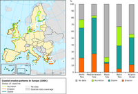
The map and the graph show the coastal erosion patterns in Europe (2004)
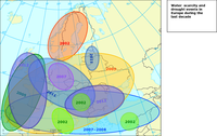
The map shows the main drought events in Europe in 2002 - 2011

The broad-scale global array of temperature/salinity profiling floats, known as Argo, has already grown to be a major component of the ocean observing system. Argo is a standard to which other developing ocean observing systems can look to. For example, Argo offers ideas on various topics such as how to collaborate internationally, how to develop a data management system and how to change the way scientists think about collecting data. Deployments began in 2000 and continue today at the rate of about 800 per year.

The figure shows the probability of complete loss of northern Fennoscandian areas suitable for palsas during the 21st century estimated using a probabilistic projection of climate change for the SRES A1B scenario
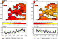
Warm days are defined as being above the 90th percentile of the daily maximum temperature and cool nights as below the 10th percentile of the daily minimum temperature (Alexander et al., 2006). Grid boxes outlined in solid black contain at least three stations and so are likely to be more representative of the grid-box. High confidence in the long-term trend is shown by a black dot. (In the maps above, this is the case for all grid boxes.) Area averaged annual time series of percentage changes and trend lines are shown below each map for one area in northern Europe (green line, 5.6 ° to 16.9 °E and 56.2 ° to 66.2 °N) and one in south-western Europe (purple line, 350.6 ° to 1.9 °E and 36.2 ° to 43.7 °N).
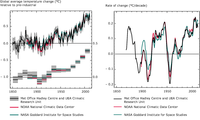
Left figure: Global average air temperature anomalies (1850 to 2011) in degrees Celsius (°C) relative to a pre-industrial baseline period for 3 analyses of observations: 1) Black line - HadCRUT3 from the UK Met Office Hadley Centre and University of East Anglia Climate Research Unit, baseline period 1850-1899 (Brohan et al., 2006) with the grey area representing the 95% confidence range, 2) Red line – MLOST from the US National Oceanic and Atmospheric Administration (NOAA) National Climatic Data Centre, baseline period 1880-1899 (Smith et al., 2008), and 3) Blue line - GISSTemp from the National Aeronautics and Space Administration (NASA) Goddard Institute for Space Studies, baseline period 1880-1899 (Hansen et al., 2010). Upper graph shows annual anomalies and lower graph shows decadal average anomalies for the same datasets.
Right figure: Rates of change of global average temperature (1850 to 2011) in ºC per decade, based on 10-year running average of the 3 datasets: 1) Black line - HadCRUT3 from the UK Met Office Hadley Centre and University of East Anglia Climate Research Unit, baseline period 1850-1899 (Brohan et al., 2006), 2) Red line – MLOST from the US National Oceanic and Atmospheric Administration (NOAA) National Climatic Data Centre, baseline period 1880-1899 (Smith et al., 2008), and 3) Blue line - GISSTemp from the National Aeronautics and Space Administration (NASA) Goddard Institute for Space Studies, baseline period 1880-1899 (Hansen et al., 2010).

Trends as % of change

WEI+ index calculated in monthly time step (calculated using parametr of returns in the denominator) for Morava river basin district shows the variability of the indicator during the year. The annual values of the indicator do not provide clear insight about the vulnerability of the area.
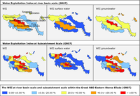
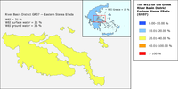
WEI total (left), for surface water (middle) and groundwater resources (right) at river basin (top) and sub-catchment
scale (bottom) within the Greek RBD eastern Sterea Ellada (GR07).
-
Document Actions
Share with others