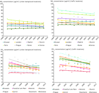
Trends of NO2 and PM10 atmospheric concentration at urban background and traffic locations. Comparison in several European urban area

Table shows the impacts and consequences of climate change on forest growth and forest conditions.
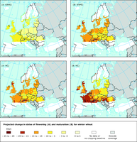
This figure shows the model estimated mean change in dates of flowering and full maturation for winter wheat for the period 2031–2050 compared with 1975–1994 for the RACMO (KNMI) and HadRCM3 (Hadley Centre.HC) projections under the A1B emission scenario.

Currently available data does not support graphic production.
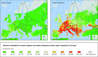
This figure shows the climatic suitability for the mosquitos Aedes aegypti (left) and Aedes albopictus (right) in Europe. Darker to lighter green indicates conditions not suitable for the vector whereas yellow to red colours indicate conditions that are increasingly suitable for the vector. Grey indicates that no prediction is possible.
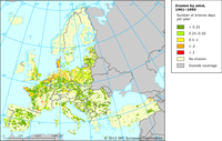
Calculations are based on wind velocity and soil texture.
While the overall patterns of erosion are generally sound, the validation of erosion data can be challenging. The data presented are currently being validated through comparisons with national datasets and expert judgement. In this sense, zooming in on a specific locality can give the impression of a situation that differs from reality.
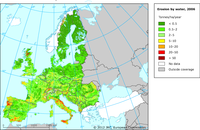
Calculated by the Revised Universal Soil Loss Equation (RUSLE).
While the overall patterns of erosion are generally sound, the validation of erosion data can be challenging. The data presented are currently being validated through comparisons with national datasets and expert judgement. In this sense, zooming in on a specific locality can give the impression of a situation that differs from reality. In addition, the model used in this exercise does not consider localised intense precipitation.
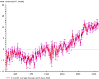
Ocean heat content is defined as the integrated temperature change times the density of seawater, times specific heat capacity from the surface down to the deep ocean.
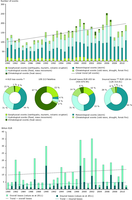
Natural disasters in EEA member countries from 1980 to 2011.
Events can occur in several countries; events are counted country-wise.
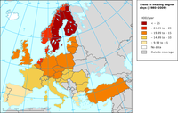
The map shows the trend in heating degree days in the EU-27 (1980-2009)
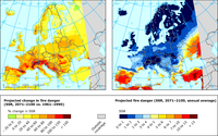
Fire danger is expressed by the Seasonal Severity Rating (SSR). Based on projections by the Regional Climate Model (RCM) RACMO2 driven by the Global Climate Model (GCM) ECHAM5 for the SRES A1B emission scenario.
Left: projected change in SSR by 2071–2100 as compared to 1961–1990 baseline period; Right: projected annual average SSR in 2071–2100.
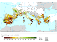
This figure shows the relative change in water availability for irrigation as projected under the A1B emission scenario by the HIRHAM (DMI) regional climate model for 2071-2100 relative to 1961-1990. Light yellow areas indicate no change in water availability.

This figure shows the rate of change of the ‘water balance’.
The map provides an estimate increase (red in map) or decrease (blue in map) of the volume of water required from irrigation assuming that all other factors are unchanged and given that there is an irrigation demand.
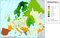
This map provides an aggregated picture of expected changes in crop yields across Europe for the 2050s (compared with 1961–1990). The simulations by the ClimateCrop model are based on an ensemble of 12 GCMs under the A1B emission scenario. They include effects of changes in temperature, precipitation and CO2 concentration on crop yields of three main crops assuming current irrigated area.
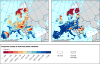
The map shows the mean changes in effective solar radiation (MJ m-2), which is an indicator for water-limited crop productivity, for the period 2031–2050 compared with 1975–1994 for the RACMO (KNMI) and HadRCM3 (Hadley Centre.HC) projections under the A1B emission scenario.
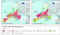
The figure shows the simulated change in water-limited wheat production for 2030 compared with 2000 for the A1B emission scenario using a cold (ECHAM5) (left) and a warm (HADCM3) (right) climate change projection.
The simulation was performed on a 25x25 km grid (assuming current area of wheat cropping) but the results are presented here at the NUTS-2 level.
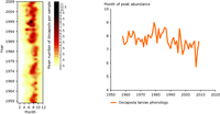
Left: Decapoda larvae abundance (number of individuals) in the central North Sea (1958–2009).
Right: Phenology shown as average month of peak decapoda abundancein the central North Sea (1958–2009).

SMOS provides a global image of surface soil moisture every three days; this map covers the period 8–15 June 2010. Yellow colours indicate drier soil surfaces; blue colours denote wetter conditions. SMOS can measure soil moisture levels to an
accuracy of 4 % at a spatial resolution of 50 km — about the same as detecting a teaspoonful of water mixed into a handful of dry soil.
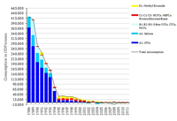
Consumption is defined as production plus imports minus exports of controlled substances under the Montreal Protocol.
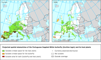
This figure shows spatial mismatches of the Portuguese Dappled White butterfly (Euchloe tagis) and its host plants under the BAMBU scenario (climate: A2) for 2050-2080. Green, suitable climate space for the host plants;orange, suitable climate space for the butterfly; red, suitable area for both butterfly and host plants; open circles, currently observed distribution. BAMBU: Business-As-Might-Be-Usual scenario.
Document Actions
Share with others