
The figure shows the generation of packaging waste and GDP in the EU-15 countries from 1998-2010

The figure shows the treatment of packaging waste 1997-2010

The figure shows the recycle of packaging waste by country in 2008 and 2010

The figure shows the treatment of packaging waste 2005-2010

The figure shows the packaging waste generation per capita and by country in the period from 1997 - 2010.
The Croatian data reflects the collected amount (not the generated amount)
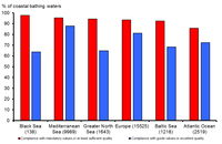
Sea regions arranged by the percentage of compliance with mandatory values (or at least sufficient quality).
EU Member States, Croatia and Montenegro. Five Member States (Austria, the Czech Republic, Hungary, Luxembourg and Slovakia) and Switzerland have no coastal bathing waters.
The quality classes under the New Bathing Water Directive (2006/7/EC) are jointed with compliance categories under the Bathing Water Directive (76/160/EEC).
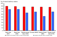
Sea regions arranged by the percentage of compliance with mandatory values (or at least sufficient quality).
EU Member States, Croatia and Switzerland. No inland bathing waters are reported from three Member States (Cyprus, Malta and Romania) and Montenegro.
The quality classes under the New Bathing Water Directive (2006/7/EC) are jointed with compliance categories under the Bathing Water Directive (76/160/EEC).
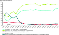
The figure shows the bathing water quality in different European countries over time: 1990, 7 EU Member States; 1991 to 1994, 12 EU Member States; 1995-96, 14 EU Member States; 1997 to 2003, 15 EU Member States; 2004, 21 EU Member States; 2005-06, 25 EU Member States; 2007 to 2011, 27 EU Member States.
No inland bathing waters are reported from three Member States (Cyprus, Malta and Romania).
The quality classes under the New Bathing Water Directive (2006/7/EC) are jointed with compliance categories under the Bathing Water Directive (76/160/EEC).
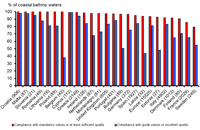
Countries arranged by the percentage of compliance with mandatory values (or at least sufficient quality).
Five Member States (Austria, the Czech Republic, Hungary, Luxembourg and Slovakia) and Switzerland have no coastal bathing waters.
The quality classes under the New Bathing Water Directive (2006/7/EC) are jointed with compliance categories under the Bathing Water Directive (76/160/EEC).
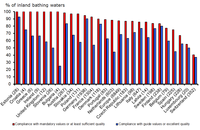
Countries arranged by the percentage of compliance with mandatory values (or at least sufficient quality).
No inland bathing waters are reported from three Member States (Cyprus, Malta and Romania) and Montenegro.
The quality classes under the New Bathing Water Directive (2006/7/EC) are jointed with compliance categories under the Bathing Water Directive (76/160/EEC).
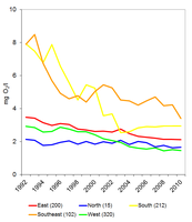
The data series per region are calculated as the average of the annual mean for river monitoring stations in the region. Only complete series after inter/extrapolation are included (see indicator specification). The number of river monitoring stations included per geographical region is given in parentheses. BOD7 data has been recalculated into BOD5 data.
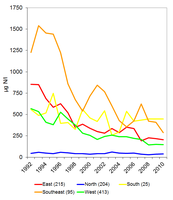
The data series per region are calculated as the average of the annual mean for river monitoring stations in the region. Only complete series after inter/extrapolation are included (see indicator specification). The number of river monitoring stations included per geographical region is given in parentheses.
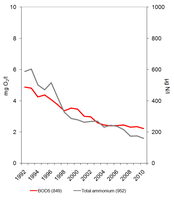
Concentrations are expressed as annual mean concentrations. Only complete series after inter/extrapolation are included (see indicator specification). The number of river monitoring stations included per country is given in metadata (see downloads and more info). BOD7 data has been recalculated into BOD5 data.
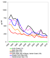
The sea region data series are calculated as the average of annual mean data from river monitoring stations in each sea region. The data thus represents rivers or river basins draining into that particular sea. Only complete series after inter/extrapolation are included (see indicator specification). The number of river monitoring stations included per sea region is given in parentheses.
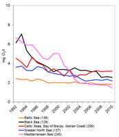
The sea region data series are calculated as the average of annual mean data from river monitoring stations in each sea region. The data thus represents rivers or river basins draining into that particular sea. Only complete series after inter/extrapolation are included (see indicator specification). The number of river monitoring stations included per sea region is given in parentheses. There were no stations with consistent data series on BOD7 in rivers draining to the Arctic Ocean. BOD7 data has been recalculated into BOD5 data.
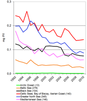
The sea region data series are calculated as the average of annual mean data from river monitoring stations in each sea region. The data thus represents rivers or river basins draining into that particular sea. Only complete series after inter/extrapolation are included (see indicator specification). The number of river monitoring stations per sea region is given in parentheses.
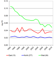
The data series per region are calculated as the average of the annual mean for river monitoring stations in the region. Only complete series after inter/extrapolation are included (see indicator specification). There were no stations with complete series after inter/extrapolation in the South and Southeast regions. The number of lake monitoring stations included per geographical region is given in parentheses
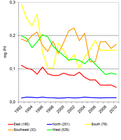
The data series per region are calculated as the average of the annual mean for river monitoring stations in the region. Only complete series after inter/extrapolation are included (see indicator specification). The number of river monitoring stations included per geographical region is given in parentheses
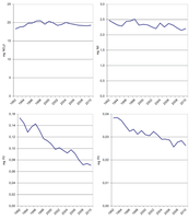
Concentrations are expressed as annual mean concentrations. Only complete series after inter/extrapolation are included (see indicator specification). The number of groundwater bodies/river stations/lake stations included per country is given in parenthesis.
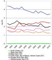
The sea region data series are calculated as the average of annual mean data from river monitoring stations in each sea region. The data thus represents rivers or river basins draining into that particular sea. Only complete series after inter/extrapolation are included (see indicator specification). The number of river monitoring stations included per sea region is given in parentheses.