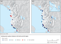
Map is divided into two frames; left frame shows the achieved bathing water quality in Albania in 2015 whereas the right frame shows the achieved bathing water quality in 2019. Bathing water locations (points) are colored in accordance to achieved quality class: Excellent (dark blue), Good (blue), Sufficient (light blue), Poor (red). If not enough samples for quality classification are available, status Not classified (grey) is applied.
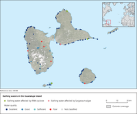
Map shows achieved bathing water quality on Guadalupe Island in 2018 as well as bathing waters affected by IRMA cyclone (green diamond) and Sargassum algae (pink diamond). Bathing water locations (points) are coloured in accordance to achieved quality class: Excellent (dark blue), Good (blue), Sufficient (light blue), Poor (red). If not enough samples for quality classification are available, status Not classified (grey) is applied.
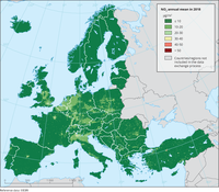
The map represents the calculated concentrations of NO2 (annual mean) combining monitoring data with results from the European Monitoring and Evaluation Programme (EMEP) chemical transport model and other supplementary data.
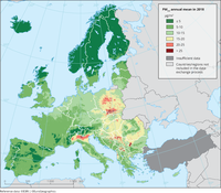
The map represents the calculated concentrations of PM2,5 (annual mean) combining monitoring data with results from the European Monitoring and Evaluation Programme (EMEP) chemical transport model and other supplementary data.
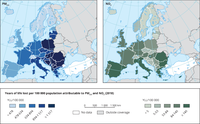
The maps show the number of years of life lost per country attributable to air pollution (PM2.5 left and NO2 right).
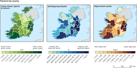
The maps show the variations in green urban spaces, self-reported health and deprivation by county.
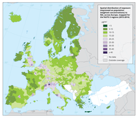
The colour gradient shows the population-weighted average by NUTS 3 region for the years 2013 and 2014.

This map shows the number of deaths related to flooding per million inhabitants (cumulative over the period 1991–2015, with respect to 2015 population).

EU Member states are divided into three groups depending on the level of regulation applied to electromagnetic fields within their country. This maps show this geographical variation.
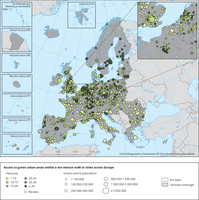
The map shows the population-weighted median area of green urban areas and forests that can be reached within 10 minutes' walking time.
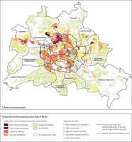
Integrated environmental justice map of Berlin
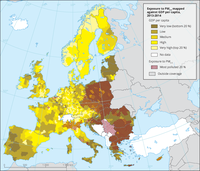
The map uses a colour gradient to show the GDP per capita per NUTS3 region, classified in quantiles against the highest exposure to PM2.5 pollution represented as hatched areas (only the top 20 % of PM2.5 are shown).
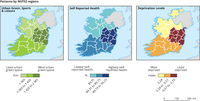
The maps show the variations in green urban spaces, self-reported health and deprivation by region.
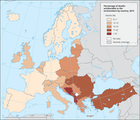
Map showing the percentage of deaths in each country attributable to environmental factors
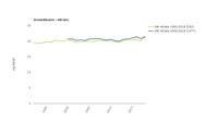
The data series are calculated as the average of annual mean concentrations for groundwater bodies/river stations/lake stations in Europe. Only complete series after inter/extrapolation are included (see indicator specification). The number of groundwater bodies/river stations/lake stations included per country is given in the notes below the individual substance charts.