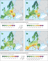
The maps use a colour gradient to show the population-weighted average PM2.5 (top left), PM10 (top right), NO2 (bottom left) and O3 (bottom right) concentrations (µg/m3) by NUTS 3 region, for the years 2013 and 2014. The colour scale varies from dark green representing low values, purple representing high values.

The map uses a colour gradient to show the percentage of working age population with higher education per NUTS2 region, classified in quantiles, against the highest exposure to high temperatures (top 20 % of number of days with maximum temperature exceeding 35 °C) represented as hatched areas.
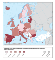
This map shows the proportion of the population per country exposed to road traffic noise at or above 55 dB Lden (average day-evening-night noise levels).

The maps use a colour gradient to show the number of hot summer days (Tmax > 35 °C) per year (1987-2016 average, top left), the number of combined summer days (Tmax > 30 °C) and tropical nights (Tmax > 20 °C) per year (1987-2016 average, top right), the cooling degree days per year (1990-2015 average, bottom left) and the heating degree days per year (1990-2015 average, bottom right).
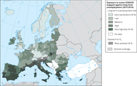
The map uses a colour gradient to show the long-term unemployment rate per NUTS2 region, classified in quantiles, against the highest exposure to O3 pollution represented as hatched areas (only the regions in the top 20 % of O3 exposure are shown as hatched).

The map uses a colour gradient to show the percentage of young children in the population

These maps show the percentage of households unable to keep their home warm in winter (2016; left) and the share of population living in a dwelling not comfortably cool during summer (2012; right).

This map presentes the number of people who died as a result of extremely low temperatures and cold weather spells between 1990 and 2016.

The map uses a colour gradient to show the long-term unemployment rate per NUTS2 region, classified in quantiles, against the highest exposure to PM10 pollution represented as hatched areas (only the top 20 % of PM10 are shown).
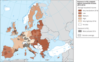
The map uses a colour gradient to show the average household income per NUTS2 region, classified in quantiles, against the highest exposure to NO2 pollution represented as hatched areas (only the regions in the top 20 % of NO2 exposure are shown as hatched).

EEA templates and data, for map production in accordance with EEA Guidelines.
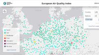
NEW MOBILE APP AVAILABLE FOR DOWNLOAD --- How clean is the air you’re breathing right now? How does the air in your city compare with that of a neighbouring city or region?
Air pollution is the single largest environmental health risk in Europe. The European Environment Agency's European Air Quality Index allows users to understand more about air quality where they live. Displaying up-to-the-minute data for the whole of Europe, users can gain new insights into the air quality of individual countries, regions and cities.

The CORINE Land Cover (CLC) inventory was initiated in 1985 (reference year 1990) to standardize data collection on land in Europe to support environmental policy development. Updates were produced in 2000, 2006, 2012 and 2018. Change layers were produced for 2000, 2006, 2012 and 2018.