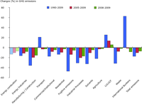
International bunkers are international transport emissions (Memo items: international aviation and international maritime transport) and are shown in the chart because they are the fastest growing source of emissions in the EU. They are however not included in the national totals reported as part of the national greenhouse gas inventories under the UNFCCC. The sector LULUCF (Land use, land use change and forestry) is not included in the national totals under the UNFCCC either. LULUCF in the EU is a net carbon sink, resulting from higher removals by sinks than emissions from sources. A positive change in LULUCF means a reduction in emissions (i.e. a removal of emissions).
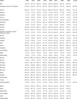
The renewable electricity share in Norway is above 100% in some years because a part of the (renewable) electricity generated domestically is exported to other countries. No data is available for Iceland or Liechtenstein.
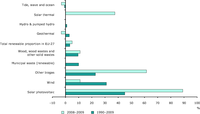
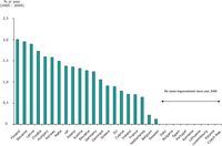
Average annual growth rates of renewable energy in electricity consumption (EU-27) for 1990-2009 and 2008-2009.
-
-
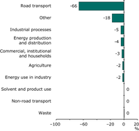
The contribution made by each sector to the total change in carbon monoxide (CO) emissions between 1990 and 2009.
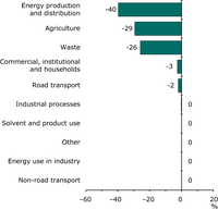
The contribution made by each sector to the total change in methane (CH4) emissions between 1990 and 2009.

Percentage change in methane (CH4) emissions for each sector between 1990 and 2009.
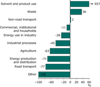
Percentage change in carbon monoxide (CO) emissions for each sector between 1990 and 2009.
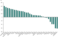
The reported change in methane (CH4) emissions for each country, 1990-2009.
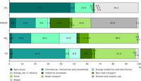
The contribution made by different sectors to emissions of the tropospheric (ground-level) ozone precursors.
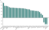
The reported change in carbon monoxide (CO) emissions for each country, 1990-2009.
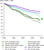
This chart shows past emission trends of nitrogen oxides (NOx), non-methane volatile organic compunds (NMVOC), carbon monoxide (CO) and methane (CH4) in the EEA-32 and EU-27 group of countries. In addition - for the EU-27 - the aggregated Member State 2010 emission ceilings for NOx and NMVOC are shown.
For the transport sector, the ODEX (Energy Efficiency) is calculated out at the level of 8 modes or vehicle types: cars, trucks, light vehicles, motorcycles, buses, total air transport, rail, and water transport. The overall energy efficiency index aggregates the trends for each transport mode in a single indicator for the whole sector.
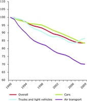
The figure shows the energy efficiency progress in transport as ODEX index
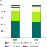
The figure shows the share of energy consumption by mode in total transport in EU-27
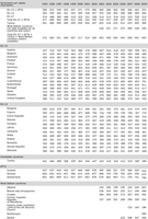
Municipal waste generation per capita in Western Europe (EU-15), New Member States (EU-12), EU countries (EU-27) and total in Europe (EU-27 + Turkey, Croatia, Norway, Iceland, Switzerland)
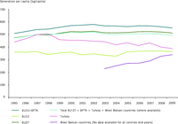
Municipal waste generation per capita in Western Europe (EU-15 + Norway, Iceland and Switzerland), New Member States (EU-12), EU countries (EU-27), Turkey, Western Balkan countries and total in Europe (total)
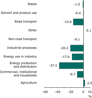
The contribution made by each sector to the total change in primary PM10 particulate matter emission between 1990 and 2009.

The contribution made by each sector to the total change in primary PM2.5 particulate matter emissions between 1990 and 2009.